Witch Children
A 2008 article in the Los Angeles Times from Associated Press reports that thousands of African children have been abandoned, tortured and murdered because they are believed to be witches. While in the West the belief in witchcraft has largely died out, the burning and murdering of “witches” was common practice in Europe and North America. The infamous Salem witch trials are a well-known example of this witchcraft belief induced hysteria. Another worrisome trend in Africa is that children have not only been victimized by believers in witchcraft, but that they are also used as witch-finders resulting in people being convicted and punished on the basis of children's testimonies.
By the start of the seventeenth century many children were being punished and put in prison for taking part in witchcraft, usually because of their alleged participation in Sabbats.It was a common belief that witches' children inherited witchcraft from their parents. Witches were thought to pass on their power and knowledge to their children. It was often the practice when charging a person with witchcraft to charge the whole family. Witches who confessed often claimed that they learned witchcraft from a parent.
Thursday, March 7, 2013

Tag Line Ideas
-Revenge is bittersweet
-She wants you
-Family Love
-Revenge knows no boundaries
-Evil runs in the family
-Dont look back
-Trust comes at a cost
-Revenge runs in her veins
-Trust noone
-Everything comes at a cost
-She'll never forget
We chose 'Revenge Knows No Boundaries' as we thought it was the most effective, it is ambiguous and leaves the audience wanting to know more about the film itself. Also we felt it was the most relevant with regards to the storyline and the idea of 'Revenge' and the fact that anything is possible as we've broken the social acceptance of family relationships by having a murder by a mother to her own daughter.
-She wants you
-Family Love
-Revenge knows no boundaries
-Evil runs in the family
-Dont look back
-Trust comes at a cost
-Revenge runs in her veins
-Trust noone
-Everything comes at a cost
-She'll never forget
We chose 'Revenge Knows No Boundaries' as we thought it was the most effective, it is ambiguous and leaves the audience wanting to know more about the film itself. Also we felt it was the most relevant with regards to the storyline and the idea of 'Revenge' and the fact that anything is possible as we've broken the social acceptance of family relationships by having a murder by a mother to her own daughter.
Poster Inspiration Research
When planning on how to design our poster we researched exisiting horror film posters, from observing existing posters we decided to make our poster portrait as this seemed to be a typical convention of posters of this genre.

The Devil Inside poster was quite captivating as the eyes are quite a prominent feature of the picture which we decided was a good element to have, and as a re-occuring theme in our own project is eyes we decided to use this in our own poster.
The line 'Inspired By True Events' is also common in horror film posters/ websites/ trailers as it adds authenticity and a real life slant on a story to make it more interesting for the audience, we decided we also wanted to include this element in our own poster.


The line 'Inspired By True Events' is also common in horror film posters/ websites/ trailers as it adds authenticity and a real life slant on a story to make it more interesting for the audience, we decided we also wanted to include this element in our own poster.

The Possession poster is quite simple in terms of colour scheme which we thought draws extra attention to the picture and makes it more effective, as a result of this we decided to keep a simple colour scheme on our own poster. Again the words 'Based On A True Story' is present on the poster which adds authenticity to the plot.
We also liked the way the credits are set out on the poster, they are at the bottom and more insignifcant in comparison to the picture so they dont draw away attention, so we decided to
include this in our own poster.
We also liked the way the credits are set out on the poster, they are at the bottom and more insignifcant in comparison to the picture so they dont draw away attention, so we decided to
include this in our own poster.

The Insidious poster has the main focus of the eyes in the poster, which we thought again is very effective. The colours of the typography stand out quite prominently which is important to make the name of the film more memorable. Another feature of the poster we liked was to have the release date of the film in the middle of the credits, but in a bigger and bolder font, we thought it was an effective feature and would also use this in our own poster.
Tuesday, March 5, 2013
Makeup Research
When creating a character profile we wanted to finalise more intimate detail such as the makeup we would use on our main character, we decided as the theme is supernatural and the child has been murdered she would need to look more un-worldy.

We researched girls makeup in films such as the Exorcist and The Ring, we found that the skin normally looked distorted which gives the character an un-human complexion, which is what we were aiming to achieve. We also planned to make the face dis-coloured to make the character look ill, we thought a blue tinge to the skin would give a cold and un-nerving feel.
.jpg)
Her eyes would be the main focus of our research as they are the most prominent features on a face and in horror films, different effects or lenses etc are used in eyes as this is very effective and this is something the audience will notice straight away about the character, and know that something is wrong. We planned to use contact lenses of a white/blue colour to give our character's eyes a supernatural feel.
.jpg)
We also decided to have heavy dark black makeup as in research that we've done on every female actress used in a role like ours the eye makeup has been very prominent and helps the eyes to stand out a lot.
The dark around the eyes also creates a sense of illness and disturbance in the character themselves.
We researched girls makeup in films such as the Exorcist and The Ring, we found that the skin normally looked distorted which gives the character an un-human complexion, which is what we were aiming to achieve. We also planned to make the face dis-coloured to make the character look ill, we thought a blue tinge to the skin would give a cold and un-nerving feel.
Her eyes would be the main focus of our research as they are the most prominent features on a face and in horror films, different effects or lenses etc are used in eyes as this is very effective and this is something the audience will notice straight away about the character, and know that something is wrong. We planned to use contact lenses of a white/blue colour to give our character's eyes a supernatural feel.
We also decided to have heavy dark black makeup as in research that we've done on every female actress used in a role like ours the eye makeup has been very prominent and helps the eyes to stand out a lot.
The dark around the eyes also creates a sense of illness and disturbance in the character themselves.
Costume Research
 When creating a profile for our character we researched different horror films and we found that using a girl as a main protagonist is very stereotypical of horror films.
 Traditionally, a girl is presented as the victim and has been changed in some way- influenced by possession for example or an evil character.

As girls are seen as more vulnerable than boys and the more innocent of the sex, young girls in these films are portrayed as innocent looking so their costume is usually plain clothes.
 Particularly among younger characters, the character wears a white night dress at some point in the film. Looking at different films such as the Exorcist we took inspiration from this and decided for our costume for our main character would be a white night dress.
 Not only does this give a feel of vulnerability
but also to have an 'evil' child in a nightdress is quite disturbing.
We also took inspiration from these films and took note of the hair and makeup which we also put our own spin on and included similar things in our own piece.
Final Website

As a finished product we were pleased with the outcome of our website. We conformed to the typical layout that nearly all websites follow, we felt it was easy to navigate and user friendly something which we noted as being key. We stuck to the colour theme of the poster which showed continuity throughout the project and used different colours for different things in order for them to stand out. The layout of everything is clear and simple to use, from using programmes such as Ipiccy and Photoshop we were able to edit and distort the image of the eye and blend in the background to avoid seeing the outline of a picture, to try and make it looks more professional
Initial Research- Graveyards

When doing our initial research we decided to shoot scenes in a graveyard as we felt this was a scary scene for us to base the story in as the theme of our project is death and supernatural events. A particular graveyard we found that we thought would be suitable for filming in was Charlton graveyard as it is a really big graveyard and is easily accessible.

The graveyard has also been there for a long time so has a lot of different types of grave stones, some that have been there for a long time and are of a different style and sometimes more religious in comparison to more modern ones. We felt older ones were more appropriate as the religious element would be good to include in our project as its stereotypically tied in with horror films.

Final Website Deconstruction
Website Deconstruction
When making the website we had recognised that a convention we had to include was the links to different parts of the website such as 'cast' and the 'gallery' etc. We conformed to this and included these at the top of our website making it clear for people to navigate to different parts of the website making it user friendly, by doing this it allows the audience to interact with the page making it more interesting. As we had decided to base our trailer using a 'true story' element we also included a link to the 'real story' to captivate the audience. Additionally we included links to social media sites at the top left of our website, which can be used as a form of promoting and advertising the film to a wider audience.

The title is pivotal to the website, as essentially the audience needs to know the title of the film so by putting it at the top of the page this made it clear to our audience. The tag line 'revenge knows no boundaries' we decided to also put this at the top of the page as we wanted it in a central position so that it was clear to the audience. We also felt it would be in a good position to put it underneath the main title as people could then associate the tag line with the title of the film, moreover we changed the font colour to red to make it stand out against the white title on the black background keeping to our colour scheme.

The eye was a focal point of our website, we included the same image that we had included on our poster to show continuity throughout our project. We had edited the image on photoshop to make it look more effective and eye catching. Originally we wanted to position the image in the centre of the website as we thought it would grab the audience's attention, however from our research we noticed it was a convention of websites to have the trailer in the centre of the website, therefore we then decided to move it to the left hand side so that it didn't detract from the trailer, but was also still in a prime position.

A convention of a film website is to have critics reviews, we conformed to this by including critics reviews below our trailer, we found this was a good position for them as we didn't want everything to be at the top of the website making it look messy, or confusing for the audience, so by having them at the bottom below the trailer people can see the reviews while watching the trailer something we believed was a good idea.

Final Poster

This is our final poster, we were happy with the outcome as we feel we have created a poster that looks professional but by creating elements such as the font and picture ourselves we added a personal touch. By using programmes such as Photoshop and iPiccy we were able to edit the pictures and the text into different colours to create the specific look we wanted. We blurred the edges of the photo of the eye so the sides of the picture would not appear as harsh and would blend in better to create a more professional look.
Final Poster Deconstruction

We chose to have the title at the top so it stood out and also made it white as against a black background it looks very prominent. We felt our typography fitted in with the theme of our teaser trailer and looked quite professional once inserted onto the poster.

Also conforming to a stereotypical layout we included the tag line straight underneath the title so that would be the second thing the audience would read when looking at the poster. From doing research into horror film tag-lines we decided to keep our tag-line short and snappy so it is memorable and makes more of an impact. We also kept this in a similar font to our title to show continuity and make the poster look neater.

Most film posters include credits so we felt to add authenticity to our own poster we would include credits and the names of all the people involved in helping to make our trailer. However we didn't want these to stand out too much on the poster so we placed them at the bottom so they did not appear too prominent, which conforms to a stereotypical layout of a film poster. We also included a release date on our poster as this is a vital piece of text included on most film posters, we made this the same font as our tag line to show continuity.

We also added a Facebook link, we felt it was important to include a social media link as it is good advertising on a film poster, and allows promotion to a wider audience, and so people could gather more information about the film if they wanted to.

We included 'BASED ON TRUE EVENTS' at the bottom of the poster which is commonly used in a horror film poster or trailer to make the film more scary if the audience think the story is real, more times than not this is usually not true.
As well as this we included the names of production companies, Lionsgate and Twisted Pictures as they are normally included in film posters which we depicted from our research.

Research- Typography
To cultivate ideas for our typography we used different font generators but mainly 'DaFont' which includes a range of different fonts. We searched for it under the 'Horror' section on the website. We wanted to have our title all in uppercase letters to make it stand out more and to make it more memorable when someone looks at the poster. This also conforms with stereotypical horror titles as most of them are in capital letters.


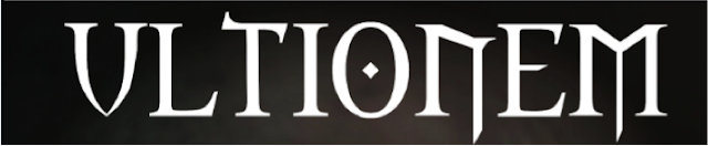
Some problems we encountered included the fonts being too 'worn away' so they wouldnt come up properly on photoshop and wouldnt look professional. We ended up going for a font that was more solid but still had a classical horror feel to it. It has a slightly more medievil feel as apose to a common horror font. We also chose to invert the colours and have the title as white on a black background as we felt this stands out more and also would fit in with the chosen colour scheme of our poster. We noticed the star in the centre of the O which we felt fitted in with our on going theme of eyes in our project, the serifs on the letters also give the text a more classic feel which older style texts normally have.

Initial Research
When researching for our trailer and coming up with ideas and looking for inspiration we watched a range of horror movie teaser trailers to help cultivate ideas.

We watched the Devil Inside trailer, in which there was a 911 call, we felt this made it authentic and also with a horror story when it has an element such as supernatural events it helps to make it authentic so it seems real, we did this to subvert the common sterotype of supernatural happenings being classed as unreal.
We did research into different 911 calls and chose one which we felt was appropriate and fitted in with our story perfectly.

We also watched the Sinister trailer, we drew inspiration from text being inserted as we felt this gives the audience an extra insight into the story which will effectively draw them in and make them want to watch the whole film which is the ideal outcome of a trailer. Short and snappy sentences are ideal for them to flash up to keep the audiences attention. We also thought it was important to have the text stand out against a dark background so we included this in our own media piece.

We watched the Saw2 trailer, and liked the idea of cameras and being watched as we felt this creates a scary atmosphere for the viewer as "being watched" by someone is a common fear among people. We included this in our own media piece and made a 'night vision' effect my changing the visual effects on the clip, this conforms to stereotypical horror genre as most paranormal or supernatural happenings happen at night when the protagonist is asleep and at their most vulnrable.

We also watched Case 39 when doing research, a common theme in this film and many other horror films is that the child is the main character and it is the one who gets killed/possessed or is evil. We all found this was a scary element and thought it would be good to include it in our own project. In our peiece in particular the child was killed innocently so has been provoked to act in a revengeful manner. We are subverting the common social stereotype of an innocent loving little child being evil however we conform to the common horror stereotype of chosing a girl and not a boy.
We watched a range of horror teaser trailers but felt these were some of the main points that we drew inspiration from. Other elements of research included makeup and costume which we drew from films such as the exorcist but finalising more finite details came later on in our project.

We watched the Devil Inside trailer, in which there was a 911 call, we felt this made it authentic and also with a horror story when it has an element such as supernatural events it helps to make it authentic so it seems real, we did this to subvert the common sterotype of supernatural happenings being classed as unreal.
We did research into different 911 calls and chose one which we felt was appropriate and fitted in with our story perfectly.

We also watched the Sinister trailer, we drew inspiration from text being inserted as we felt this gives the audience an extra insight into the story which will effectively draw them in and make them want to watch the whole film which is the ideal outcome of a trailer. Short and snappy sentences are ideal for them to flash up to keep the audiences attention. We also thought it was important to have the text stand out against a dark background so we included this in our own media piece.

We watched the Saw2 trailer, and liked the idea of cameras and being watched as we felt this creates a scary atmosphere for the viewer as "being watched" by someone is a common fear among people. We included this in our own media piece and made a 'night vision' effect my changing the visual effects on the clip, this conforms to stereotypical horror genre as most paranormal or supernatural happenings happen at night when the protagonist is asleep and at their most vulnrable.

We also watched Case 39 when doing research, a common theme in this film and many other horror films is that the child is the main character and it is the one who gets killed/possessed or is evil. We all found this was a scary element and thought it would be good to include it in our own project. In our peiece in particular the child was killed innocently so has been provoked to act in a revengeful manner. We are subverting the common social stereotype of an innocent loving little child being evil however we conform to the common horror stereotype of chosing a girl and not a boy.
We watched a range of horror teaser trailers but felt these were some of the main points that we drew inspiration from. Other elements of research included makeup and costume which we drew from films such as the exorcist but finalising more finite details came later on in our project.
Cemetry Scenes
Graveyards have always been a huge tradition in horror movies, and are very popular these days. They generally bring back terrible, sad, and lonely feelings from their visitors, but they are also a fabulous setting for certain horror films, mostly because of its religious imagery. The gravestones and internal feelings create a creepy atmosphere that is almost universal, but you still have hundreds of dead bodies buried ceremoniously below the surface which makes it more scary. It’s not hard to see why horror films so often put a focus on cemeteries; it’s a location that everyone automatically associates with dread and terror. Many films have used graveyards as their main location, ours was only one scene in the trailer. Below i will discuss some films that use graveyards.
I Sell the Dead (2008): A grave robber named Arthur reflects back on his life right before his hanging to a priest about how he used to go to random cemeteries and dig up bodies to sell for medical experimentation. I sell the dead is a low budget horror comedy with a very dark type of humor. It uses the cemetry through the film, especialy in the plot where it is used as a metaphore for new beginnings.

Cemetery Man (1994): Francesco’s main occupation is to live at the cemetery and re-kill the dead that come to life after they have been buried for 7 days in his cemetery. The setting makes the story not very clear and everything you may have thought about it is questioned in subsequent viewings. It is confusing to watch and the setting in a cemetry makes it scarier.

Pet Sematary (1989): Pet Sematary is about a family who goes through a terrible tragedy when their young child is struck by a truck and is killed. They bury him in the pet cemetery behind their home to resurrect him. Only catch is that he doesn’t come back to life exactly the same way that he left. The cemetry is the main location and some of the scenes are pretty shocking. (see picture)
 |
Editing- Sound

We started to insert music into our teaser trailer, we found our first piece of music by doing research into what stereotypical horror teaser trailer music sounded like. Initially we selected a piece that was eerie and created a tense feeling. We selected the music pieces that we wanted and then downloaded them from a range of sites including SoundCloud and Youtube. We then imported them on to iTunes and could drag and drop them on to iMovie and insert them where we wanted.
We drew inspiration from different trailers for music such as Sinister and The Devil Inside, we chose to include music with child-like connotations such as a music box sound with a nursery rhyme playing over the top of it.

We then experimented with layering the different tracks we had selected, we selected a few standard base tracks with a steady pace all the way through to create an atmosphere, we then chose certain music to fit in to places where we wanted it to be tense for example- we inserted a fast paced music track. Another example of this is when we imitated nightvision shots, we had the crackle of a camera music track and inserted this to give it a more real feel (inspiration from paranormal activity)

During our montage piece at the end we wanted fast paced and racy music to create tension and to keep the audiences attention. The music for a montage makes a big difference as it entices the viewer to keep watching. We layered the different tracks making the most fast paced ones the loudest and turned the volume up.
Monday, March 4, 2013
Editing- Title

When creating our trailer one of the first things we did was create our typography, for the font we drew inspiration from a more traditional horror script. We created the font on the website 'dafont', then saved it as a picture and edited the colours on photoshop to create the black background to make it stand out prominently.
We then inserted it as a picture on to iMovie and were able to change how long the word appeared on the trailer for, we inserted it at the end, as this is a common convention of a film teaser trailer.
This typography was consistent throughout our ancillary texts, to make it more recognisable as a whole package. We chose this font as we felt it had more classic horror connotations with serifs on the letters, the 'O' in 'Ultionem' also looks like an eye which is a recurring theme throughout our project.
At first when we inserted the text as a picture it came up quite small, we made the picture much larger to take up more of the screen so it stood out more to the viewer, making it more memorable.
Subscribe to:
Posts (Atom)