Showing posts with label Poster Deconstruction. Show all posts

Thursday, March 7, 2013

Poster Inspiration Research

When planning on how to design our poster we researched exisiting horror film posters, from observing existing posters we decided to make our poster portrait as this seemed to be a typical convention of posters of this genre.


The Devil Inside poster was quite captivating as the eyes are quite a prominent feature of the picture which we decided was a good element to have, and as a re-occuring theme in our own project is eyes we decided to use this in our own poster.
The line 'Inspired By True Events' is also common in horror film posters/ websites/ trailers as it adds authenticity and a real life slant on a story to make it more interesting for the audience, we decided we also wanted to include this element in our own poster.


The Possession poster is quite simple in terms of colour scheme which we thought draws extra attention to the picture and makes it more effective, as a result of this we decided to keep a simple colour scheme on our own poster. Again the words 'Based On A True Story' is present on the poster which adds authenticity to the plot.
We also liked the way the credits are set out on the poster, they are at the bottom and more insignifcant in comparison to the picture so they dont draw away attention, so we decided to
include this in our own poster.


The Insidious poster has the main focus of the eyes in the poster, which we thought again is very effective. The colours of the typography stand out quite prominently which is important to make the name of the film more memorable. Another feature of the poster we liked was to have the release date of the film in the middle of the credits, but in a bigger and bolder font, we thought it was an effective feature and would also use this in our own poster.

Tuesday, March 5, 2013

Final Poster


This is our final poster, we were happy with the outcome as we feel we have created a poster that looks professional but by creating elements such as the font and picture ourselves we added a personal touch. By using programmes such as Photoshop and iPiccy we were able to edit the pictures and the text into different colours to create the specific look we wanted. We blurred the edges of the photo of the eye so the sides of the picture would not appear as harsh and would blend in better to create a more professional look. 

Final Poster Deconstruction

For our final poster, we chose to conform to a stereotypical horror poster layout by having the picture as the centre of the poster and as the main focus. We felt an eye would stand out on a poster and draws the audience in to look at it, we found this from research into horror posters. This also links in to the theme of our teaser trailer as throughout the trailer the theme of eyes is re-occuring. We edited the picture to make the eye blurry as we felt this gave it a sense of ambiguity, but we then enhanced the other parts of the picture to make them clear to create a contrast. 


We chose to have the title at the top so it stood out and also made it white as against a black background it looks very prominent. We felt our typography fitted in with the theme of our teaser trailer and looked quite professional once inserted onto the poster.


Also conforming to a stereotypical layout we included the tag line straight underneath the title so that would be the second thing the audience would read when looking at the poster. From doing research into horror film tag-lines we decided to keep our tag-line short and snappy so it is memorable and makes more of an impact. We also kept this in a similar font to our title to show continuity and make the poster look neater.


Most film posters include credits so we felt to add authenticity to our own poster we would include credits and the names of all the people involved in helping to make our trailer. However we didn't want these to stand out too much on the poster so we placed them at the bottom so they did not appear too prominent, which conforms to a stereotypical layout of a film poster. We also included a release date on our poster as  this is a vital piece of text included on most film posters, we made this the same font as our tag line to show continuity.


We also added a Facebook link, we felt it was important to include a social media link as it is good advertising on a film poster, and allows promotion to a wider audience, and so people could gather more information about the film if they wanted to.


We included 'BASED ON TRUE EVENTS' at the bottom of the poster which is commonly used in a horror film poster or trailer to make the film more scary if the audience think the story is real, more times than not this is usually not true. 
As well as this we included the names of production companies, Lionsgate and Twisted Pictures as they are normally included in film posters which we depicted from our research. 


Wednesday, October 17, 2012

The Apparition Poster Deconstruction


·         Dark black /grey background convention of a horror poster, can’t see much of the background
·         Picture of the girl takes up the majority of the poster, it’s positioned in the middle so our eyes immediately focus on her
·         The hands all around her body almost grabbing her look like could be something like zombies, they look old, grey and skeletal  
·         She looks quite a pretty teenage girl, with dark curly hair
·         Stereotypical to have a young girl as the victim, they are portrayed as being more vulnerable and weak
·         However the girl doesn’t look too scared, so it doesn’t make the audience feel scared or worried for her
·         The title is capitalised so that it stands out  and the title is white to contrast the dark background
·         The tag line ‘once you believe you die’ is also capitalised it’s quite ambiguous which is done to intrigue the audience
·         It has the release date in the bottom of the poster in quite small font but in an orangey colour to stand out
·         We assume the genre of the film could be about possession because of the hands all around her, as if they are controlling her and the hands covering her mouth like an evil spirit of force could be controlling her
·         There is a slight glow around the edge of her creates a paranormal/ supernatural atmosphere

Thursday, October 4, 2012

The Amityville Horror Poster Deconstruction

The colours of the poster are very dark and mysterious; there is a house which looks haunted highlighted with the effect that the man is shining a light on it. He appears to have a weapon in his hand or some sort of unknown object.
The title is in red, with AMITYVILLE larger than the other words. This accentuates the title all together. Using the word horror in the title makes us know the genre of the film. Underneath the red title, there is a line of white text that says “based on the true story”, making it seems more realistic and scary. On the wall on the left it says “Katch em & Kill em”; it is self written and looks really realistic. It could suggest that there are killings and gore in the film.

Paranormal Activity 3 Poster Deconstruction

·         The typography of the poster is very simplistic. The top line “discover how the activity began” is in a font styled like a type writer in a contrasting white colour on black.
·         The title is in red which is a colour used alot in horror films, but as there are 3 films in the sequel the “3” is in glowing blue to accentuate the sequel number
·         The Blue ties in with the fact alot of the movie are filmed in night vision which is a blue tinge.
·         The tag line is “it runs in the family” this is joining in with the other two films as well, so viewers who have seen the past movies will understand this more and feel the need to see the film
·         It is all very simple positioning,  with the photo covering most of the black background.
·         From this poster you can clearly tell that it is a horror, possibly a physiological horror.    

  •   The choice of image is good 

Insidious Poster Deconstruction

·         Movie title is vertical, makes you think and read differently. The ‘SI’ is highlighted red which is a strong colour that represents horror and blood
·         The colour scheme is really dark, for example the sky is cloudy and dark
·         It neatly incorporates ‘from the makers of’
·         A house in the background is suggesting and  could link in with the storyline
·         Figure of a child is dark and mysterious, his eyes are distorted and his whole physique is dark and not very realistic or visible
·         The target audience will be for teenagers or adults, this is definitely not for young children
·         The poster suggests that the genre is horror; it is very dark and looks like the film is going to be scary or horror orientated.
·         “it’s not the house that’s haunted” is the tag line, directly underneath the title. This is a very ominous line and it doesn’t give much away about the storyline. But it does tie in with the house in the background and also it makes the audience think could it be the child which is haunted?
·         Everything is very central, which gives the poster some structure.

Wednesday, October 3, 2012

Case 39 Poster Deconstruction

·         The black background connotes a sense of fear of the unknown as it takes up the majority of the poster. The colour black we can associate with death or fear as we cannot see who or what is there, this can make the audience feel on edge and predicts what type of film this will be.
·         The bit of light in the bottom corner makes it look like a door is slightly open and they’re being exposed to something which they’re trying to hide from.
·         The positioning of them in the bottom corner makes it look like they’re hiding from something. As they are on the floor lower down it makes them seem inferior as opposed to if they were right in the middle of the poster or at the top of the poster, we are not immediately drawn to the characters in the corner.
·         The way Renée Zellweger is holding the little girl shows she is trying to protect her, she can be seen as a mother like figure in the film and this displays the type of relationship they have with each other
·         The look of smoke coming in from the bottom corner as it then fades into darkness gives it a mysterious look, it looks as if they are looking past that direction so something is coming from that corner
·         The tagline ‘some cases should never be opened’ adds to the mysteriousness feel, it gives us an indication that because it has been opened this is the reason from them hiding or as to why something has gone wrong.
·         The other tagline ‘they’ll never stop’ this is ambiguous it could be referring to the protagonist never stopping to find out what has happened or the antagonist never stopping to hurt something
·         The colour scheme of black and white is very simple, the two colours are used to create a contrast, and it could symbolize good or bad.
·         They show the names of the main actors in it to try to attract people to go and see it, for example if they see that their favourite actor is the main character they would be more inclined to go and see the film
·         The title stands out in the poster as they have increased the font size, the rest of the typography is a similar size and quite small, because it’s a simple poster the title will have to stand out more

Thursday, September 27, 2012

The Shrine Poster Deconstruction

·         By the positioning of the figure in the middle of the poster, it immediately attracts our attention to it. Behind the figure it looks like it is just in a room which hasn’t been looked after the paper peeling away from the walls and the dingy dirtiness of the walls highlights this.
·         The poster is simple with only the figure taking up the majority of the poster, this shows that the figure is the main focus of the film  
·         The plain dreary colours of the background provides a contrasts to the blood stained figure in the middle of the poster, this foreshadowing the significance of  blood and danger to come later in the film
·         The figure is wearing a mask this is generally done to hide the person identity of face, as a convention in many horror films they use a mask to cover up the identity of the antagonist  
·         The title is capitalised to make it stand out in the bottom of the poster, the typography is quite plain however it looks like parts of the words are being worn away, this adds authenticity to it. The title is in a very dark red to then fade into a more brighter red, the combination connotes images of danger and blood, as the figure has blood running down it’s body this could be made to make it look like the blood has changed the colour of the title
·         The tagline ‘ONCE YOU FIND IT, THEY WON’T LET YOU LEAVE.’  Sounds quite forceful, it’s ambiguous, could be in reference to the figure above which makes you think they don’t want to be found so when you investigate they won’t let you go. This is a common convention of horror films.
·         The word ‘they’  indicated there is more than one so more of a group or collection of them
·         The colour scheme is dingy brown and dark red,
·         They have the film website at the bottom of the poster to encourage people to also view the website

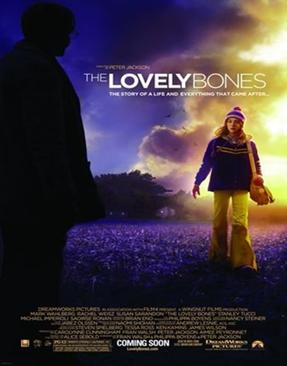
The Lovely Bones Poster Deconstruction

·         The different type of colours like a purple dark blue in the sky then on the different side of the poster the sky is yellowy golden the contrast showing  the sun coming through the clouds
·         Where the girl is positioned it looks as if she has a halo type golden around her,  this could reflect her looking down from heaven or her being our and innocent
·         She is wearing yellow trousers, a jumper and hat, this is made to look like quite a young girl. The way she is positioned is made to look like she is walking towards the man quite boldly her face may look confused or showing anxiety but the body language does not show fear approaching him which proves to us he is not a stranger to her
·         The figure of the man, dark all in black at the side suggests mysterious or a sense of fear as we cannot see him properly this contrasts what the young girl is wearing as yellow is perceived as  a bright happy colour
·         The setting looks as if the girl is walking through a field at winter time or early in the morning due to the purple and dark blue colours which are used juxtaposed with the yellow sun in the corner
·         The difference in colour between what the man is wearing and the girl is wearing can symbolize their personality, the man could be bad, scary associated with death whereas the girl looks an average young girl wearing bright colours
·         The whole title is in capital letters to stand out to the audience but the word ‘lovely’ is used in bold, this is done to stand out to the audience, the title in itself is quite strange as connotations of the word bones would be death, sadness, fear, so to put it next to the word lovely intrigues the audience, so to emphasise this even more they have made the typography different.
·         The tag line ‘ the story of a life and everything after it’ this is portraying to the audience that it’s not just the death that is the main event but the aftermath that other people have to deal with once a ,loved one has died and how that is equally traumatic

The Devil Inside Poster Deconstruction

·         Dark background with red around the edge all connotes colours of fear and danger. There looks as if there is a red tinge over the whole of the poster which again reinforces ideas of horror death blood and danger.
·         The positioning of the woman’s face slightly off centre is what we immediately look at first. When you look closer you notice her eyes look almost fake or very possessed therefore this gives us an indication that the genre of the film will be possession or demonic.
·         Moreover by what we can see that she is wearing she looks like a nun and this gives indication that there will be a religious aspect to this genre of film
·         The title is bigger than the rest of the typography and capitalised this makes it stand out, interestingly the ‘D’ in the word inside has been reversed the other way this makes it stand out and connotes ideas of supernatural things
·         The tag line ‘inspired by true events’ in the colour red conjures up images of horror death and danger, also it makes it seem much more eerie if people are lead to believe it is based on real events
·          One of the quotes ‘This is the film the Vatican doesn’t want you to see’ gives a clear indication that the film will have religious aspects in the film; the use of the nun looking possessed is quite a disturbing image as it’s subverting all the views of a person with a religious vocation
·         It says at  the top of the poster ‘from the producer of paranormal activity’ this again shows to the audience what type of film this will be if they liked films such as paranormal activity it would encourage them to go and see the film